
|
7/15/05 Q: I saw draft chapters from Making Maps years ago - why
has it taken so long for the book to be published?
A: In part because I am a born idler (for a wonderful ode to this
way of being, see Tom Hodgkinson's How to be Idle [2005]) but also because I
just got stalled with the book a few years ago. My ideas about the book were right, I
think: it should be very visual (not just words about maps) because maps are visual; it should
show the same map examples done wrong and done right; and it should be aimed at the
growing number of people who make maps but never had training or courses in cartography.
But something was seriously askew with the draft I completed -
I was not sure what, though. The draft went out to reviewers, and I got positive & useful
comments from Mark Monmonier & Amy Griffin. The third reviewer, Denis
Wood, ripped the draft to shreds. This was thrilling, as I had read and enjoyed
Denis' scathing reviews of books (and his other writings, such as The
Power of Maps) since grad school @ UW Madison, and now I was getting
demolished! But it was also thrilling because Denis put his finger on what was wrong with
Making Maps: while on the right track, it was weighed down by boring examples (a
tradition in cartography texts), useless jargon (another tradition in cartography), and
lacked the creativity necessary for a visual primer aimed at a non-specialist
audience. The manuscript also lacked any evidence of my dabbling in critical &
post-structuralist research on maps and mapping. Yes, thought I, that is it: how did I
allow Making Maps to become yet another dull, poorly organized, nerdly @ a-critical
tome on cartography? I asked Denis to be a co-author and we reworked the manuscript
completely (a huge amount of work was done on the front porch of home in
Columbus when Denis visited in the summer of 2004). Out came pointless jargon,
boring examples and in went coherent English and cooler examples (there are
still some boring examples - sorry, will swap them out if there is a 2nd edition),
and other creative flourishes. And while it is subtle and implicit, the entire book
attempts to integrate post-structuralist ideas with modernist guidance (rules,
regulations, good/poor, do this-not thats): but, you won't notice it unless you really
think about it. I am really happy with Making Maps and it was really fun to
create once I figured out what it needed to be.
|
|
8/1/05 Q: How were all the example maps in Making Maps
created?
A: The primary software I used to create Making Maps was Freehand on
a Mac. I learned Illustrator and Freehand in versions 1.0 back in the day while
working at the Cartographic Lab
at UW Madison. I have always liked Freehand better than Illustrator, despite extensive
work with both software packages. Many of the map projections in the book were created in
GeoCart, and I used ArcGIS
to create a few dozen maps. All were imported into Freehand and redesigned. The entire
book layout and design was done with Freehand - somewhat unconventional. Because the book
design and layout I wanted was unusual, I decided to "mock it up" in Freehand, assuming the whole
book would be reworked by a professional book designer, sorta following my ideas. In the end, this never happened,
my "mock up" is what became the final book layout and design. I think I need to take a
book design course, and learn more about typography (I think the text in the book is one
of its weaker points) in case there is a 2nd edition. William Meyer (at
Guilford Publications) took the Freehand files, chopped them up into single pages
(I did two-page layouts, as facing pages almost always were designed to
relate to each other) and converted them to PDF (with surprisingly few
problems) and sent them off to the printer.
|
|
8/2/05 Q: What tunes did you listen to while making Making Maps?
A: iTunes was essential software for the completion of Making Maps. I have
always listened to music while making maps, but have never been able to listen to music
while doing other work. Curious. Various and sundry tunes wafted in the background
whilst I worked on all the graphics, but a few stand out, mostly because they embody the
quirky, hard to pin down qualities I tried to embody in Making Maps. A pair of CDs
I have never stopped listening to - since I bought them decades ago - are the last two CDs
by Talk Talk, Sprit of Eden (1988) and Laughing Stock (1991). Best
known for its early 1980s start as a Duran Duran wannabe band, Talk Talk mutated
into something weird and inexplicable in the late 1980s. While I revisit some of my
college-era tunes occasionally, most all sound somewhat dated (and I am not
old enough to get nostalgic yet). But not these two Talk Talk cds. A more
recent CD that embodies the same spirit (and drummer) as Talk Talk is Bark Psychosis and their recent
///Codename:DustSucker. There is nothing similar about Talk Talk and
Bark Psychosis but they are very similar. One more and I will stop: n.Lannon. Now I am not a big fan of folk
music. And I am not a big fan of techno. But n.Lannon put them together on
Chemical Friends and the outcome (Folktronica, I guess) is
irresistible to anyone making hundreds of quirky maps.
|
|
8/3/05 Q: Is cartography dead?
A: Denis Wood thinks so, me too (maybe - kinda depends on what you
mean by "cartography"). Read his polemic Cartography is Dead (Thank
God!) (download/view the PDF here originally published
in Cartographic Perspectives
number 45, Spring 2003). It isn't that Denis believes mapping is dead -
quite the contrary. There is so much exciting stuff going on with mapping it is hard to
keep track of it all (see some of the links on the bottom of the main page). A lot of this work is outside of
the realm of academic cartography, which itself seems to be rather quiet, at least in the
American context (examples of recent cartographic research can be seen in the
AUTOCARTO 2005 and NACIS conference proceedings and
programs). There is some life beyond North America (see the ICA web site) and in "geovisualization" (maybe that is how cartography will survive in academia). The world of
custom cartography firms and freelance cartography
seems quite vital. The most wobbly, thinks I,
is the state of academic map design. While you can find abundant ways to learn about GIS
in general as well as
ArcGIS, Java, Google Map Hacking, Flash, and other technologies for mapping, there are few
places to learn about the design of maps in those contexts or in general. We seem to be
back to the late 1940s when Arthur Robinson wrote The Look of Maps bemoaning
the lack of attention paid to map design and suggesting an agenda to address the problem.
Robinson's agenda, largely based on advertising and psychology methods, user testing, etc.
(and its evolution into cognitive map studies, which bobble along, squeezing
out a few peculiar research articles a year - see Daniel Montello's review article on Cognitive
Map Design Research in the 20th Century.) didn't necessarily provide much
new practical information for map designers, and academic cartographic design research
doesn't seem to have found a comfortable place in the discipline of geography as design
has in fields such as landscape architecture, architecture, and planning (and this, in the end, is my big problem with academic cartography - it has
not done a great job of keeping up with all sorts of interesting conceptual developments
in geography - but that is my own hang-up). Academic map design folks did get lots
of dispersed map design know-how gathered together in text books, made it possible for map
design to be taught at universities, and established
cartographic labs (I
wonder how many map designers developed their skills in those cartographic labs?).
Alas, classic cartography texts (such as The Elements of Cartography
and Dent's Thematic Cartography) are out of date or unavailable, cartography
faculty are replaced by GIS folks, cartography and map design classes are replaced by GIS
classes, and the cartographic lab has transmogrified into something else - a GIS lab or
whatever - usually for, well, making maps (with GIS!).
|
|
8/4/05 Q: Did you ever make real maps?
A: Denis makes maps, and had some - from his work in progress on the Boylan Heights
neighborhood in Raleigh NC - featured on NPR's This American Life.
A few of his maps are linked there but they ain't great scans. I will get some better
ones and post them here sometime soon. As for me, Making Maps has over 300
maps in it and I made most of them; they sorta count. Below find a few maps I made in the
olden days - with scribers, stick-up type, pens and ink, all finished off with
photomechanical processes in the dark room. I was the last generation to learn and work
with traditional (non digital) map production (late 1980s) and the first to learn and work
with computer graphic design software that could make maps as well as the old traditional
techniques (Illustrator and Freehand on a Mac).

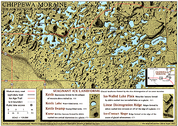
Chippewa Moraine Ice Age National Scenic Reserve (1987) was created in David
Woodward's Map Design course at the University of Wisconsin Madison:
Click to Enlarge
David knew how to do shaded relief by hand, with graphite, and showed me how. The glacial
terrain on the map was easier than "normal" terrain and the result was not bad (for a
beginner). The rest of the map was scribed & used stick-up type. My mom's
family (the Wolf's) live near the area shown on the map. The map won an Honorable Mention
in the 1987 R.R. Donnelly and Sons Map Design Competition (see below for the
map that won the competition that year).
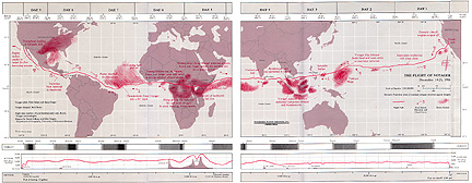
David DiBiase and me
created The Flight of Voyager (1987) when we were students at Madison (we
both worked in the Cartographic Lab):
Click to Enlarge
David DiBiase started this project when he acquired detailed flight information about the
Voyager flight - the first airplane to fly around the world without refueling. When the
publisher of the book about the flight heard we had the data, they asked us to create the
map for the book endpapers (thus the gap in the middle of the map: the left half
was the front endpaper, the right half the back endpaper). The map was published in the
hard cover version of J. Yeager and D. Rutan Voyager (New York: Knopf). The
map won the 1987 R.R. Donnelly and Sons Map Design Competition. I had to
scan the map in several pieces and there is some distortion where I photoshopped the
pieces together.
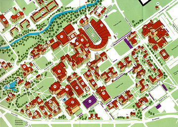
I created the University of Colorado at Boulder Campus Map (detail) (1988)
mostly by myself as a UW Madison Cartographic Lab project:
Click to Enlarge
The map was - amazingly I think - done with technical pens and ink. I traveled to Boulder to
sketch and photograph each building on campus. Back in the lab, I had to develop a
generalized sketch of each building - not too detailed but detailed enough to distinguish
the building. Each sketch was then inked on mylar and cleaned up with an x-acto knife. I
created the building windows by scanning the inked buildings into Adobe Illustrator
(probably version 1.0!), creating the windows (not the buildings) then printed the windows
really big, then reduced the printout in the darkroom, burned it on the same film we used
for type stickup, and stuck them up. I also drew all the trees by hand (pen & ink again).
This map was a tremendous amount of work. I doubt the map is used anymore, and here is a clickable WWW version that,
at least in part, replaced it. Looking at the WWW map suggests to me that technology is
providing us with more diverse media for mapping, but that the design of maps in these new
media is often mediocre at best.
|
|
8/5/05 Q: What is Denis Wood's email address?
A: Hah! Get a pen and write. He does not have an email address:
|
|
8/12/05 Q: Were any students harmed in the making of Making Maps?
A: Unfortunately, yes. There was one serious paper cut,
 a consequence of an unsupervised student assistant handling a paper map source. You
can't get a paper cut from a Google Map, or ArcGIS.
a consequence of an unsupervised student assistant handling a paper map source. You
can't get a paper cut from a Google Map, or ArcGIS.
|
|
9/9/05 Q: I tried to get a copy of Making Maps and was told it's out of stock. Why?
A: So I got a copy of Making Maps hot off the press, still reeking of ink, and was happy (and relieved) to see
that for the most part the graphics reproduced well. I did notice one error: a page that was supposed
to be printed in color was printed monochrome. It is not a page with a map on it, and it is the one color
page that didn't really need color, so no big deal thought I. Alas, I mentioned this to Guilford and they and the book's printer
decided to physically fix the error on books that had not yet been shipped. So the books sitting at
the distributor were packed up and sent back to the printer. The printer is in the process of removing the
monochrome page and attaching the corrected color page. I have been told this will not be noticeable. The
fixed books should be back at the distributor and shipping by the third week in September. Those of you who
got a copy with the error have rare first state first edition copies, which Guilford will be happy to
replace if you contact them (they may automatically send a replacement if you ordered the book from them).
|
|
9/10/05 Q: Making Maps is an weird cartography book - what were some of the ideas behind its creation?
A: The upcoming NACIS Conference (Oct. 12-15
in Salt Lake City) includes a panel of critics (Stuart Allan, George McCleary, Peter Keller, Margaret
Pearce) interrogating Cindy Brewer's new book Designing Better Maps (ESRI Press, 2005)
and Making Maps. I prepared a statement about the intent and ideas that shaped the
look and content of Making Maps.
Making Maps: A Visual Guide to Map Design for GIS: Author's Intent
When Peter Wissoker (then of Guilford Publications) asked me to write a cartography text, I told
him the world did not need another cartography text. The number of academic cartography courses
was not growing, and probably declining, despite the explosive growth of GIS. Peter then asked if
I liked existing cartography texts, and I said I did not use them in my courses. "So what kind of
text would you use, if it existed?" asked he. This question led to Making Maps. I wanted a book
that would get readers excited about maps (existing texts are rather languid), I wanted good
examples to show why map design matters and how it works (also not found in abundance in existing
texts), and I wanted to promote creativity - fundamental to good map design, and difficult to
teach. Denis helped to shape and refine the goals and develop the content of the book.
I designed the book like I would design a map. The audience? Cartography courses, maybe as a
supplement, GIS courses, certainly as a supplement, and individuals who make maps (or like maps)
but don't have a background in cartography, and don't want to be academic cartographers. Then
what? Coherent concept, a hierarchy of content emphasizing what is important and excising the
rest, creative design to grab attention and make a point, all so that the book works as well as
possible for its readers. A few key ideas shaped the design of Making Maps:
1. Maps are visual, so make the book visual (rather than textual), to promote visual thinking and
creativity, both fundamental to map design. As far as possible, focus each page on maps and
arrange text around the maps (rather than the reverse, which is what other texts do). To subsume
text and emphasize the maps required a profound generalization of all the words about maps that
dominate cartographic texts. We promote maps as a vital way of seeing patterns in data that would
not otherwise be evident, and stress that less is better than more. Apply these ideas to a map
design text: carefully designed maps, rather than words, used to reveal map design principles.
2. It is impossible to teach map design without good and creative examples, but it helps to have
poor examples to contrast with the good to show how and why design matters. Eduard Imhof used
this visual approach to the map design process in his classic article on map type, and I applied
this idea throughout Making Maps. I also tried to incorporate good and creative design in all the
maps in the book, supposing one can learn by seeing.
3. Enthusiasm and excitement about maps abound in a world where maps and the tools to make them
proliferate, so design the book to espouse enthusiasm and excitement about maps. Many of the real
maps in the book comprise a cartography of affect - hate crimes, AIDS deaths, bombing sprees,
hurricane impacts, war deaths, poverty, alcohol, queer geography, projected naked bodies, suicide,
radioactive fallout, military targeting maps, spiritual geographies, and aliens. The text and
maps were also infused with a ludic sensibility - humor, farce, satire, sarcasm, irony and play.
The mystery maps that preface the book and are between chapters encourage playful engagement (what
is it?) with maps, their visual form, and the curious things we can map. Engaged emotion and play
promote enthusiasm and excitement about maps, and creativity in their design, counter-balancing
the stern normative content (rules, regulations, good/poor, do this-not that's) in Making Maps.
Making Maps covers the basics of maps and map design, although I do believe it to be more
sophisticated than it may appear at first glance. I am pondering Making Maps II, or Making More
Maps, and what exactly a more "advanced" cartographic design text might look like.
|
|
10/23/05 Q: How does Making Maps relate to GIS software?
A: Making Maps focuses on the mapping side of GIS, or any software that allows you to design and create maps.
The examples in the book were not, for the most part, created with desktop GIS software. This is because
it is difficult (if not
impossible) to achieve (carto)graphic excellence in contemporary GIS software. Most design cartographers
who use GIS exit GIS software and design their work in software like Illustrator, Freehand, or Corel Draw. The
design capacity of GIS software will undoubtedly improve. Making Maps
provides exemplary design and ideals to shoot for. If you can't do something shown or suggested in Making Maps
with the GIS software you happen to be using, complain to the software company, and get a copy
of Illustrator, Freehand, or Corel. Such software are not that difficult to learn and will provide
you with a multitude of creative design options not available to you in typical GIS software. Your maps, in
other words, will be better. A diversity
of software for working with geographic information exists, and is evolving and developing on a daily basis.
Making Maps defines design guidelines, principles, and exemplars which transcend the diversity (and limitations) of
constantly evolving GIS software.
|
|
1/3/06 Cool: Details about AAG Sessions: Experiments with Territories: Post Cartographic Map Design
Cool: I organized some sessions at the March 2006 meeting of the Association of American
Geographers annual meeting in Chicago called, alluringly,
Experiments with Territories: Post Cartographic Map Design. Click the title for more details about
the sessions and presenters.
|
|
1/5/06 Cool: A good customer review of Making Maps on Amazon.com
Cool: A
very positive customer review of Making Maps was posted on Amazon.com recently. Ok,
it is only one review, but I'll take what I can get. It
is very sincere, and touches on some key goals we had for the book. Hoping for a few more good
reviews! Why? Amazon.com is an important means of selling books, particularly those like
Making Maps that have limited publisher's promotion. Customer reviews
are important, and studies indicate they shape buying behavior (good reviews sell
products, and poor reviews undermine sales). The system is open to manipulation, of course. For
example, Amazon has a Spotlight Reviews section, which appears above the customer
reviews. As far as I can tell, Spotlight Reviewers are those who post a large
number of reviews to Amazon (which, of course, Amazon likes). Some are certainly legit -
people who apparently have lots of time to read and write often in depth and thoughtful reviews. Other
such reviewers, though, seem
to be companies who supply reviews in exchange for a review copy of a book (which they can
sell, in essence paying for the review). Reviews from these companies are typically
generic summaries of the books, usually paraphrased from the publisher's book blurb, and
always rate the book at five stars. So if you get a bunch of mediocre reviews, you can suppress them
with these Spotlight Reviews, which show up above the customer reviews and push your
overall star ratings up.
|
|
1/7/06 Cool: A good review of Making Maps on the VerySpatial blog and podcast.
Cool: VerySpatial.com is a blog and podcast devoted to Geography and
geospatial technologies. The primary bloggers/podcasters, Sue and Jesse, do a nice job of grabbing useful information
from the web, and the VerySpatial podcast is a convenient way to
get the information (I often listen on my iPod on the drive to work). A thoughtful review of Making Maps was featured on
the VerySpatial podcast episode 21, on December 11, 2005, and a
written review was posted on January 6, 2006. I added an excerpt from the review
to the top page of this site. The review highlighted some important things
Denis and I were trying to do with the book - in particular using the design of the book itself to get readers thinking
about what design is and what it does.
|
|
1/8/06 Cool: A good review of Making Maps on the CCA's Cartography blog.
Cool: The Canadian Cartographic Association's
Cartography blog posted a good
review of Making Maps on January 7, 2006.
Cartography is a great source of cartographic news on the web. I put a bit of the review on the
top page of this site.
|
|
1/22/06 Cool tunes: Paavoharju Yha Hamaraa
Cool Tunes: Weirdest damn CD I have heard in awhile! I have an affinity for music that mixes melody and mayhem and
Paavoharju's 2005 CD Yha Hamaraa (Fonal) is a perfect CD in this respect. While affiliated with a cohort of recent
Finnish experimental folk bands (many recording for the
Fonal label in Finland), Paavoharju (from Savonlinna, Finland) really does not fit that well into any particular category
of music. Indeed, I see more affinities with Bark Psychosis
and the last two CDs by Talk Talk - although even then the differences among these bands are significant.
Mostly they bust up typical song structure without tossing out melody or song structure altogether and meld
together diverse and unexpected sounds, organic and digital. Their label claims Paavoharju is a "collective
of ascetic born-again christians" (factoid
sheet) and that certainly could be, but these are not your common, garden variety born-agains. A few MP3s of Paavoharju songs, a live version of a song from the
Yha Hamaraa CD, and two that are similar to the CD tracks, can be found at the Finnish music WWW site
Mikseri.net: Han Teki Minut Autioksi is more
ambient, sorta what the end of the world might sound like (if your into that kind of thing), Kuljin Kauas is a live version of a Yha Hamaraa
track - more traditional song structure (and kinda sounds like part of Stairway to Heaven!?), and Muukalaisen
Kotielama is a spectacular
blend of a sad folk melody with transcendental noise, exactly what you need if you want to make really weird maps.
|
|
3/29/06 Q: That weird stuff in Making Maps... did you hack your book?!
A: Hacking has diverse meanings as documented at
Wiki. It can be a prank or elaborate joke, a clever solution to a problem, a legal or illegal modification of a computer
program (for good or evil purposes), or anything that is fun and clever. A hack can also serve to undermine the
hegemonic discourse of advertising or media or government or science or
academia. Maps can be hacked as a prank or joke, to solve a particular problem, or to generate some creative outcome
not intended by the original map. Of course, a map hack may also serve to assault and undermine hegemonic discourse. Can a
textbook full of rules and regulations about map design, such as Making Maps be hacked by its author, the hacking
embedded in the design and content of the book? Nah, that would be absurd.
|
|
4/1/06 Neat: A good review of Making Maps on the Map Room blog.
Neat: A good review of Making Maps was recently posted on the Map Room
blog, on March 29, 2006.
The Map Room is a unique blog, written by a map fan, rather than a cartography "insider" (academic or practitioner) or
technical fetishist. It is readable and enjoyable... a neat blog.
|
|
4/2/06 Fascinating: A special journal issue on Art & Mapping in Cartographic Perspectives.
Yes, Fascinating: I helped organize sessions at the 2003 and 2004 NACIS
(North American Cartographic Information Society)
meetings on art and mapping, inviting some artists to present on the work they (and other's) are doing with maps. These
sessions have resulted in a special issue of the journal Cartographic Perspectives
on Art & Mapping
(Cartographic Perspectives is a journal published by NACIS; the issue will be the first of 2006, issue #53).
The papers in the issue look at artists using maps in their work, providing insights into creative engagements with mapping.
The content of the special issue:
- "Art and Mapping: An Introduction" by Denis Cosgrove
- "Map Art" by Denis Wood
- "Interpreting Map Art with a Perspective Learned from J.M. Blaut" by Dalia Varanka
- "Art-Machines, Body-Ovens and Map-Recipes: Entries for a Psychogeographic Dictionary" by kanarinka
- "Jake Barton's Performance Maps: An Essay" by John Krygier
- "A Catalogue Of Map Artists" Compiled by Denis Wood
If you are not a NACIS member and want a copy of the issue, join NACIS (it's cheap to join and
you get three issues of Cartographic Perspectives each year) or email
me, as there may be some spare copies available for sale.
|
|
5/29/06 Blah Blah: Abstract for a presentation by Wood & Krygier for
NACIS '06 in Madison WI.
Blah Blah: So you have a yearly conference all about maps - historical, technical, critical, practical, theoretical -
in all their visual glory, and in order to present at this conference you must submit an abstract. The abstracts are
always all words. Why? If maps are such an important way to express information, so important that we have to have
a conference about them, why can't a map be an abstract, or at least part of an abstract?
Click to Enlarge
|
|
6/1/06 Curious: WW2 era German geopolitical map symbols.
Curious: Whilst reading up on debates about maps as arguments during the WW2 era I came upon the following
set of Geopolitical Map Symbols in an old geopolitics book edited by Hans Weigert and Vilhjalmur Stefansson
called Compass of the World: A Symposium on Political Geography. (Macmillan, 1947, p. 23-24). The symbols
can also fit in the curious category of propaganda map symbols.
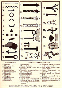
Click to Enlarge
|
|
7/18/06 Neat: A good review of Making Maps in the Journal of Planning Literature.
Neat: The Journal of Planning Literature has a review of Making Maps which is largely
positive (Vol. 21, No. 1, 2006) and I plopped a quote on the top page
here. The reviewer, Eliot Allen (a planner), does complain about the lack of color in the book. I agree!
Bottom line, my publisher was not willing to include more than two color signatures in the book. If the
book sells well enough, maybe a second edition can include more color.
|
|
7/19/06 Psycho: Presenting unMaking Maps at CONFLUX 06.
Psycho!: I will be presenting some peculiar map stuff at CONFLUX '06,
a gathering of psychgeographers in Brooklyn NY in September of '06. A brief yet intriguing description is below, with more
details to follow:
unMaking Maps: ParaCartographic Experiments
If cartography is contemporary accepted cartographic theory and
practice, then paracartography is any cartographic theory or
practice beyond those confines. Paracartographic theories, practices,
and experiments are diverse and common, may borrow from or hybridize
with conventional cartography, or even influence it, but are not
obligated to conform to its confines. Artists working with maps,
activists engaged in indigenous and counter mapping, diagrammatic
social mapping, and maps guiding or emerging from psychogeographic
activities are but a few examples of paracartography. The outcomes of
paracartographic practice and experiments may expand the possibilities
of mapping, may be funny or amusing, may undermine mainstream
cartographic theory and practice (particularly as embedded in
geographic information systems [GIS] software), may be a waste of
time, may help to understand the conventions and limitations of maps,
may be stupid or puerile, or may leak out into the world, inspiring
engagement with place and landscape.
unMaking Maps is a project growing out of my recent text on
cartographic design, Making Maps (2005, co-authored with Denis Wood).
Cartography, and particularly map design, is excessively rule-bound.
Mild experiments with book design and the tweaking of content to
include humor, critique, and the bizarre in the Making Maps book was
an attempt to undermine the normative rules in the text. unMaking
Maps takes this approach much further, systematically inversing,
undermining, and countering the rules of cartography. Specific
experiments will be demonstrated during the CONFLUX.
|